Shalom Academy Brand Identity
- Category
- Brand Identity, Custom Design, Graphic Design, Logo Design
- Updated
- 29 Oct 2026
- Status
- Completed
Shalom Academy’s brand identity began with a question: how do you express an education that nurtures the whole child? Based in the Vumba region…
Shalom Academy’s brand identity began with a question: how do you express an education that nurtures the whole child?
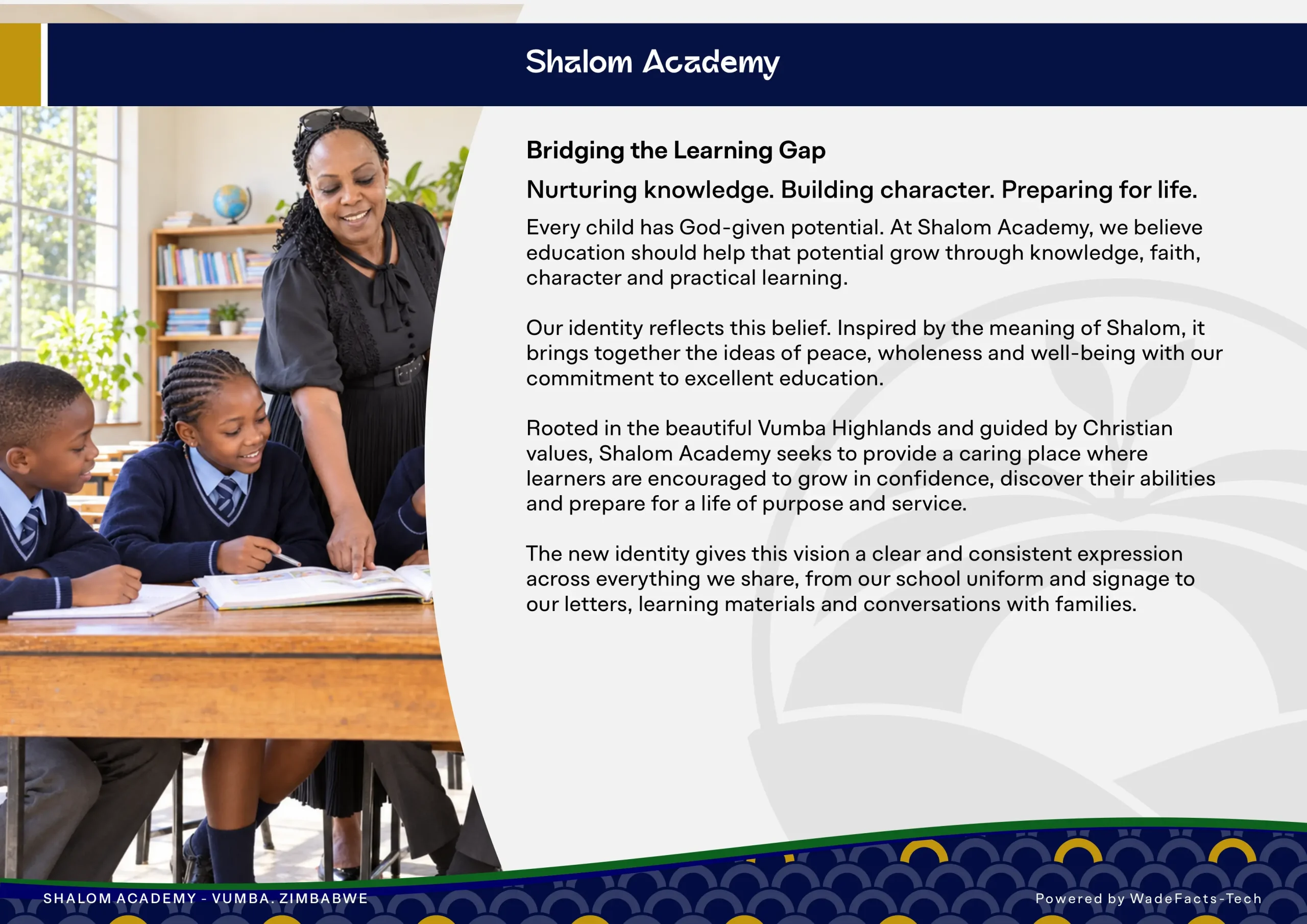
Based in the Vumba region of Zimbabwe, the academy brings together academic learning, Christian values, personal development and practical life skills. Its name carries the idea of peace, completeness and wholeness. The challenge was to translate that purpose into a distinctive visual identity that parents could trust and learners could proudly call their own.
Finding the story within the school
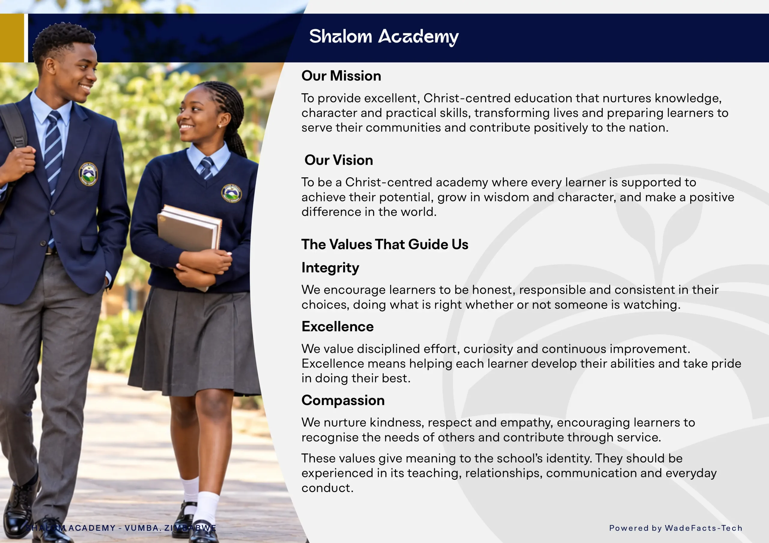
The discovery process explored the meaning behind the school’s name, the learning gaps it seeks to address and the values it hopes learners will carry into adulthood. Integrity, excellence and compassion became central to the direction.
These conversations revealed the story that would guide the design: a place where children feel sheltered, receive support to grow and develop the foundations to move forward with confidence.
The academy’s tagline, “Bridging the Learning Gap,” gave that story a clear visual starting point.
Bringing the idea into form
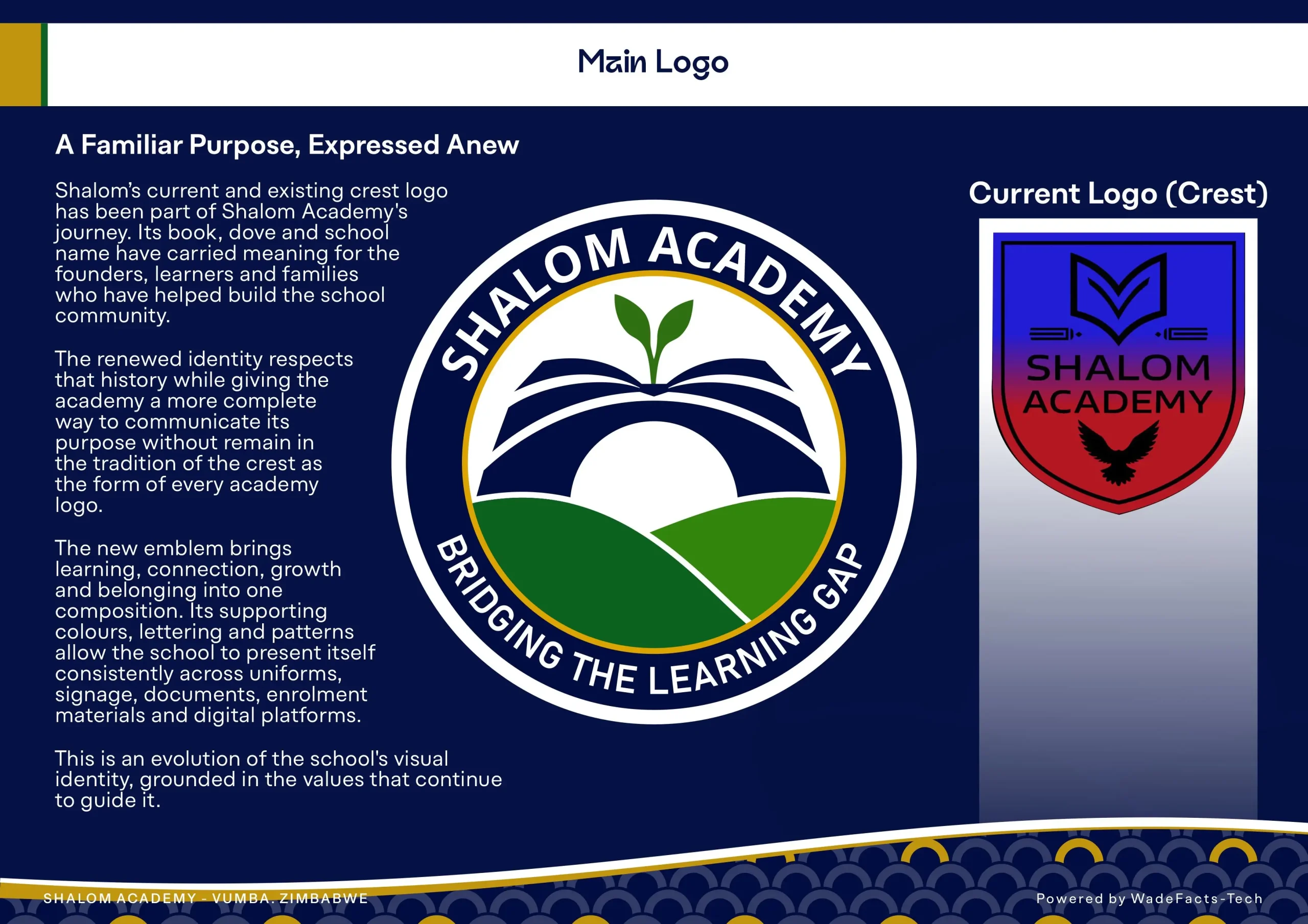
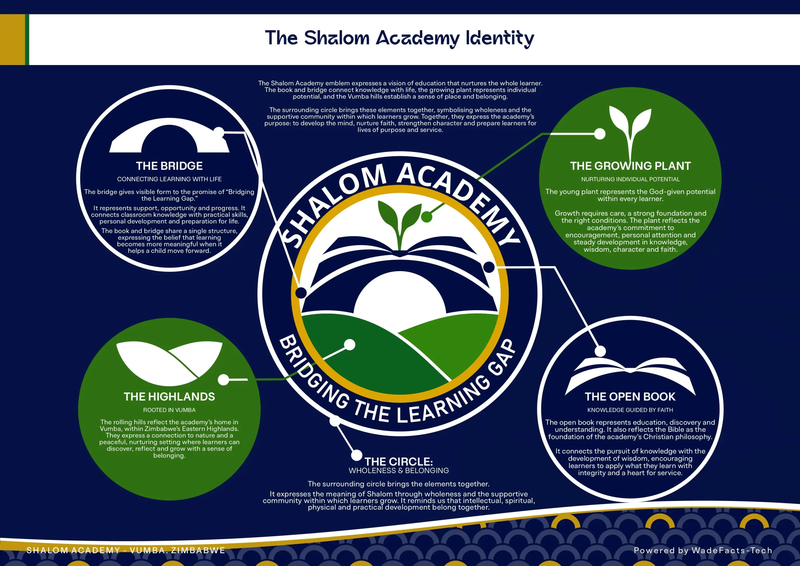
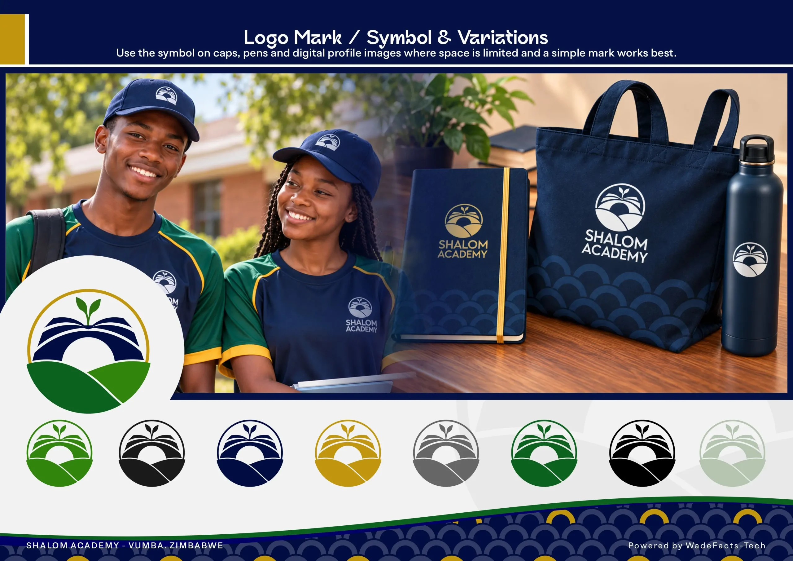
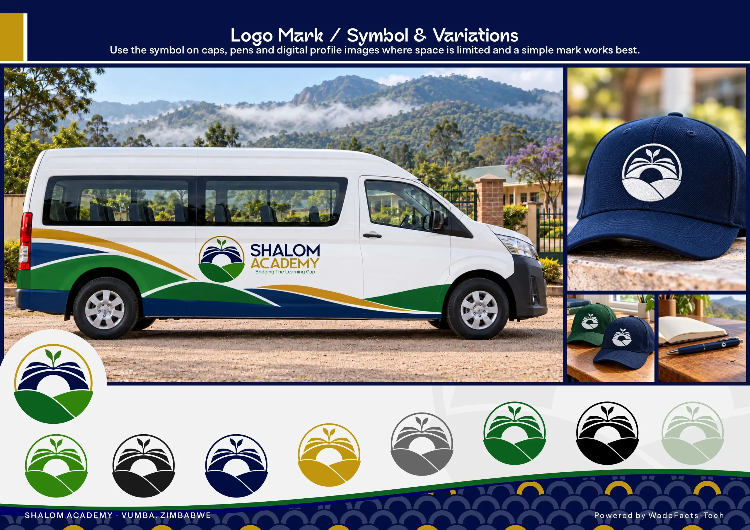
The new symbol brings together an open book, a bridge, a growing sprout and the hills of Vumba.
The book represents knowledge and understanding, while its arch suggests a bridge between a learner’s present abilities and future possibilities. The sprout expresses growth nurtured through care and guidance. The surrounding hills connect the identity to the academy’s setting, giving the mark a sense of place and belonging.
A fine gold arc frames these elements, suggesting shelter, unity and wholeness. Together, they express the meaning of Shalom through a compact, purposeful form.
Building on an existing foundation
Refreshing a school identity means working with something that already holds meaning for its community. The direction needed to respect that connection while giving the academy a clearer and more consistent way to present itself.
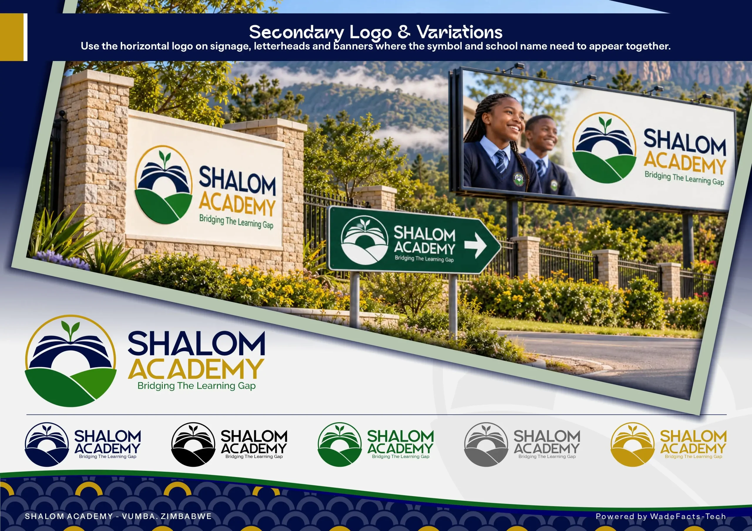
The redesign carried forward the school’s commitment to faith and education, bringing those ideas into a visual system suited to everyday use. From embroidered uniforms to roadside signage, the identity needed to remain recognisable across different sizes, materials and settings.
Creating a complete visual language
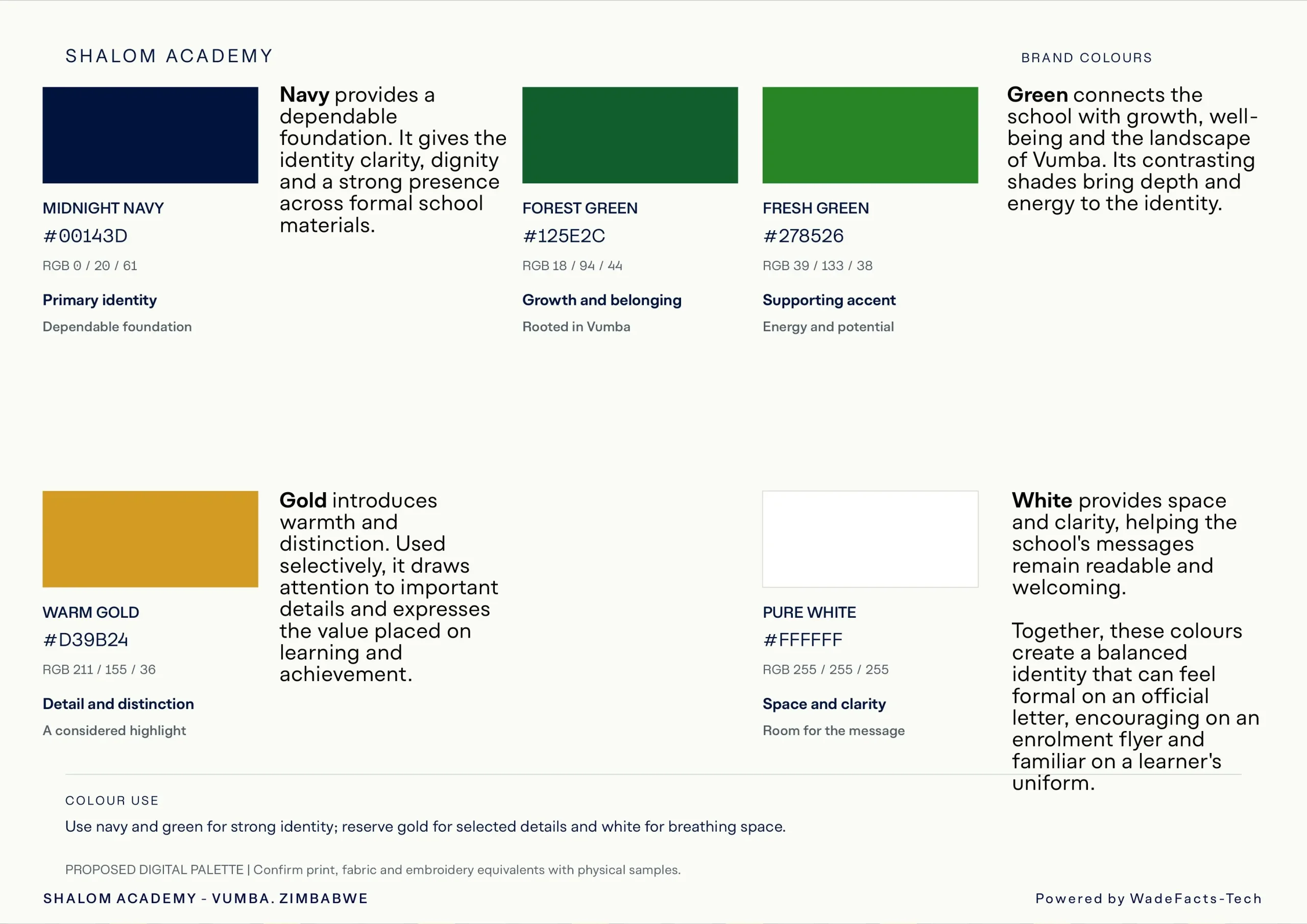
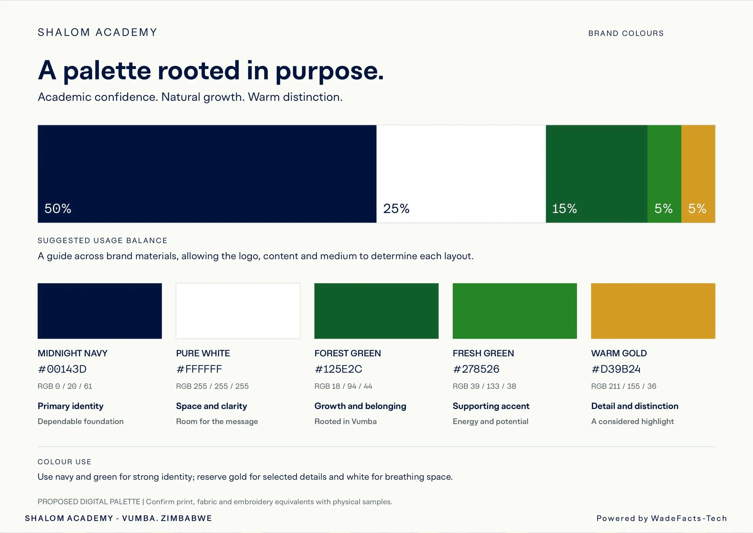
The colour palette balances the depth of navy with greens drawn from growth and the Vumba landscape. Gold adds warmth and distinction, while white provides clarity and space.
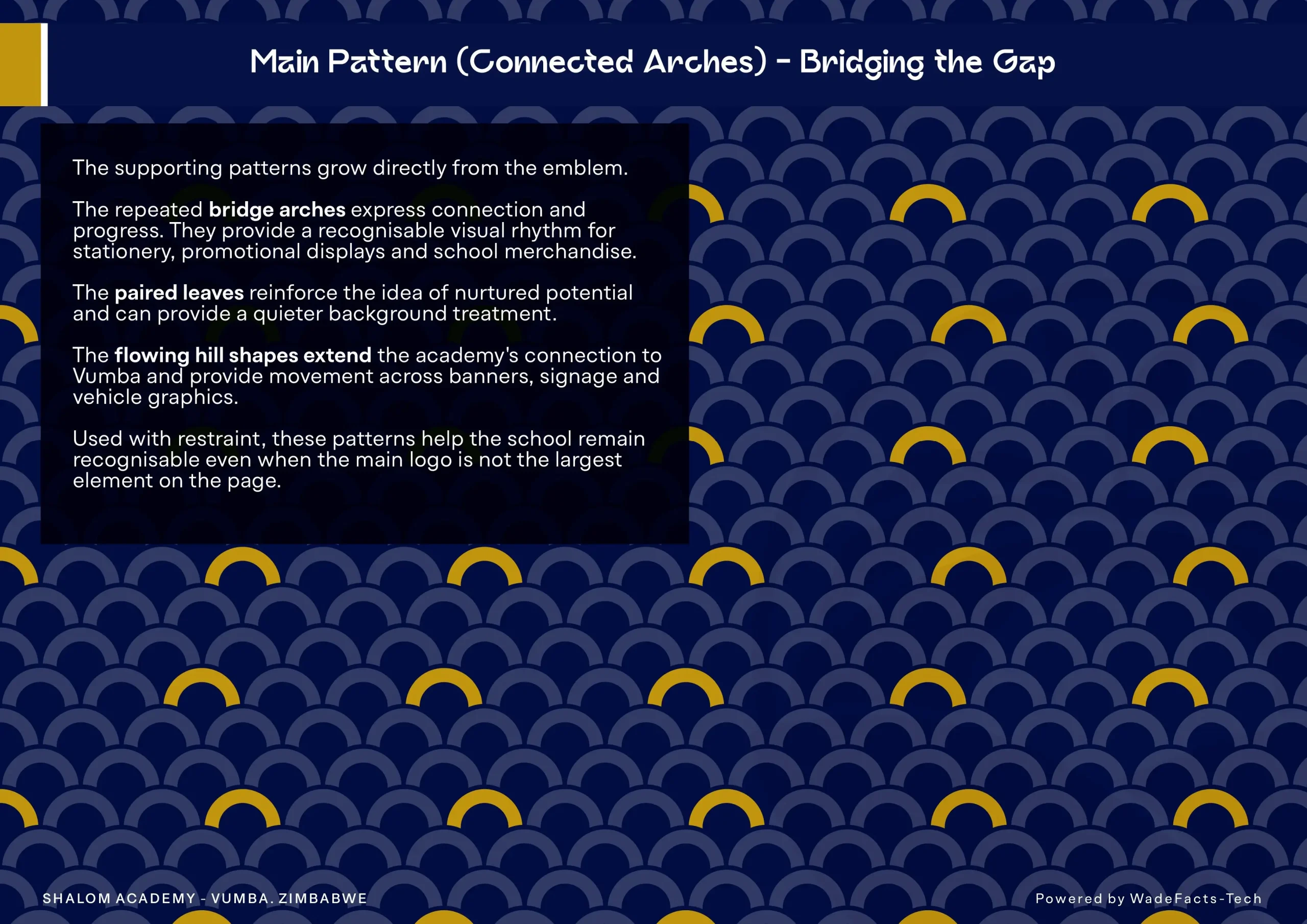
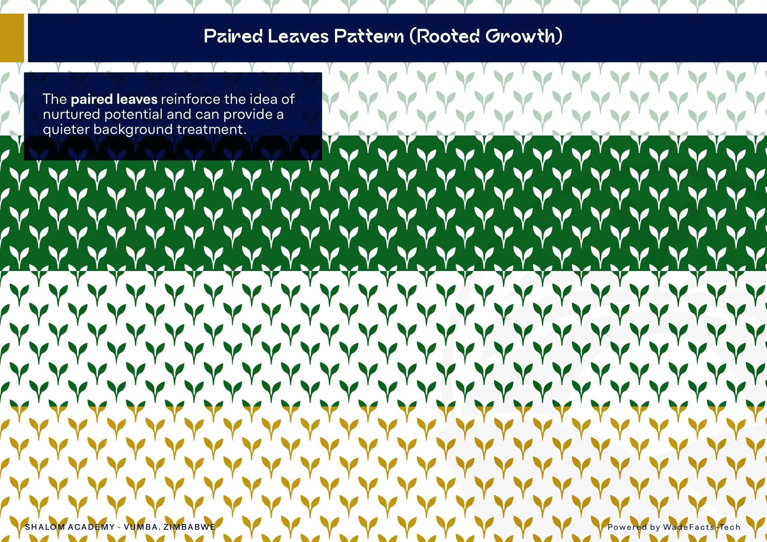
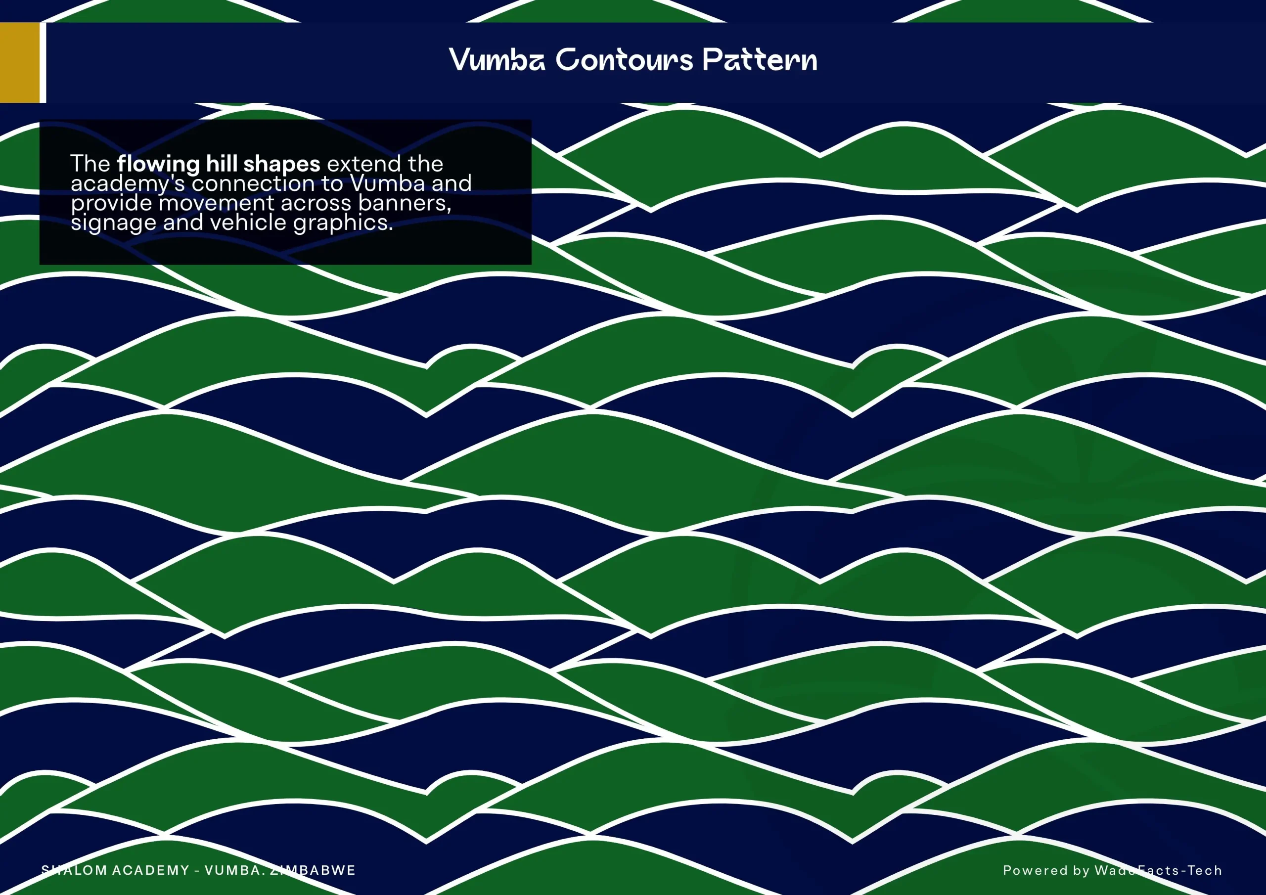
The logo’s forms also became the foundation for a family of patterns. Repeating arches extend the idea of bridging, sprout motifs reinforce nurtured growth, and flowing contours echo the surrounding hills. These elements allow the brand to feel connected even when the full logo is absent.
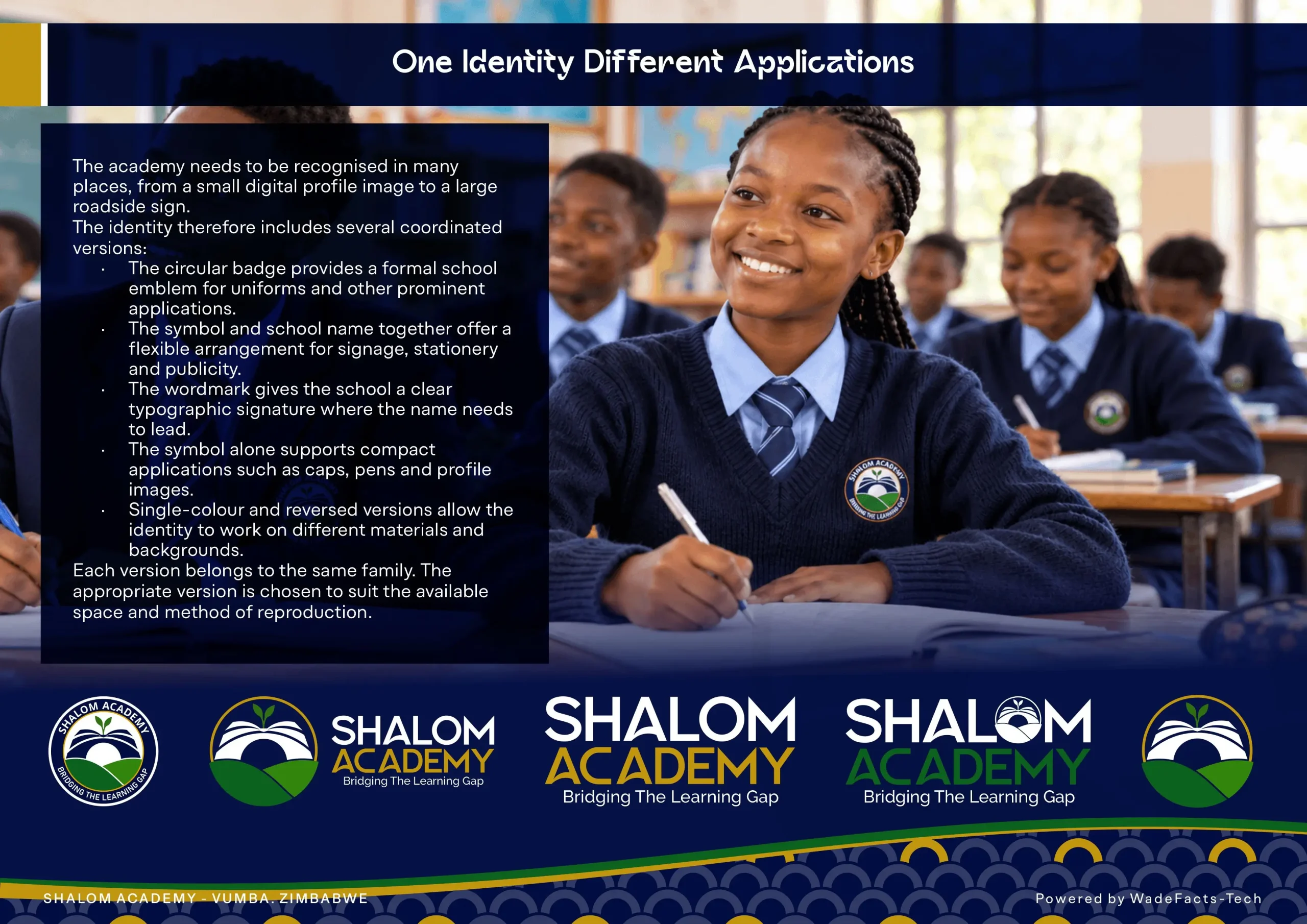
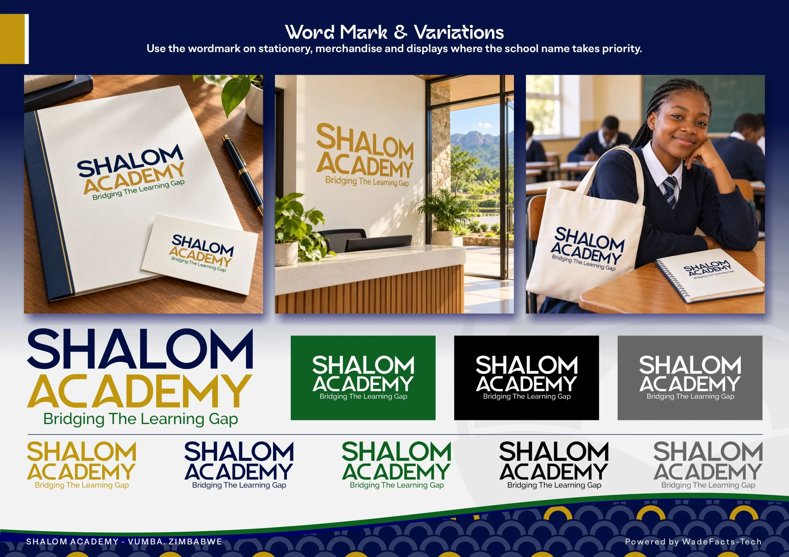
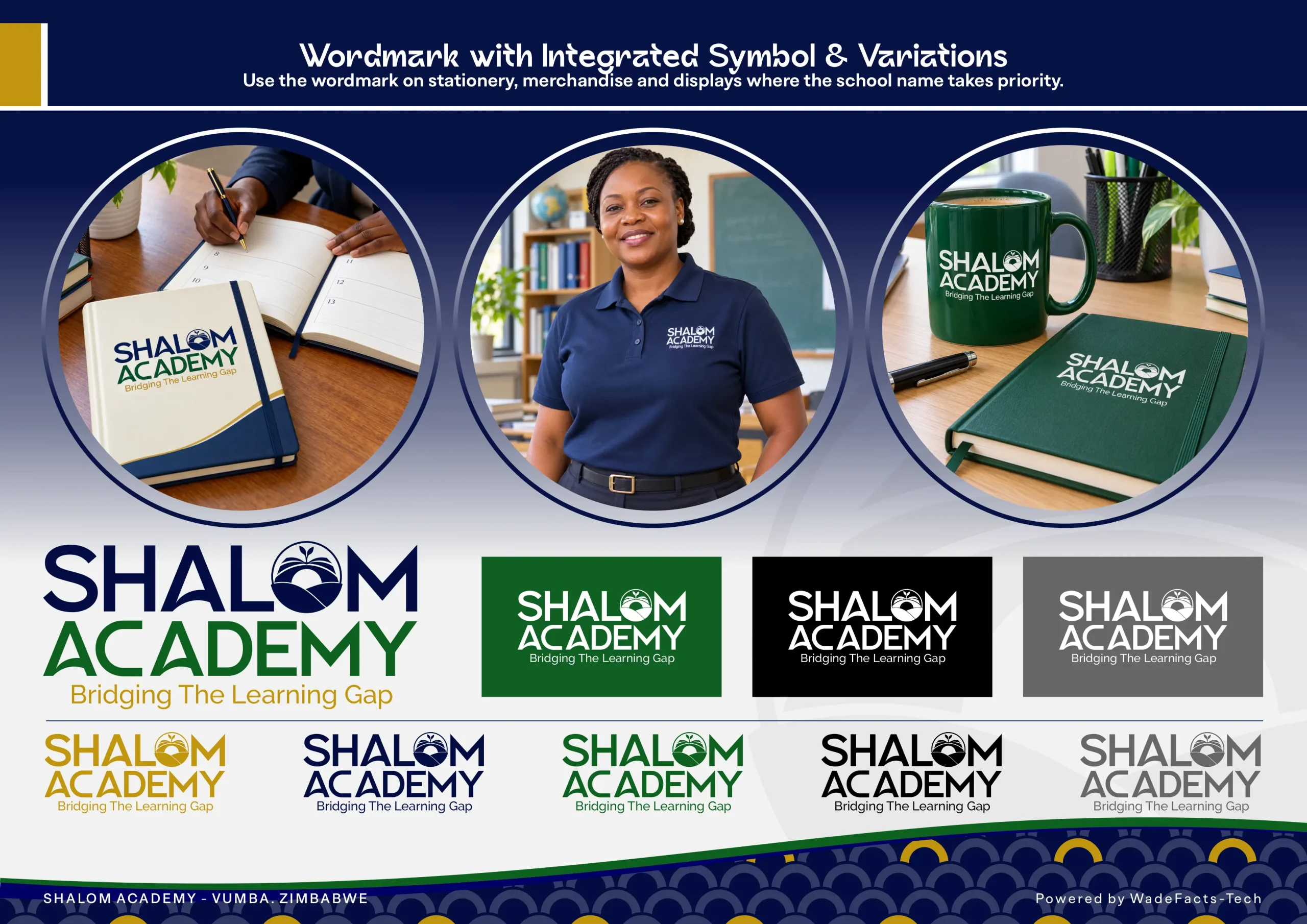
A responsive set of logo versions supports different applications, from the formal circular badge to horizontal arrangements, wordmarks and the standalone symbol.
Taking the identity into everyday life
The final stage explored how the brand could become part of the school experience.
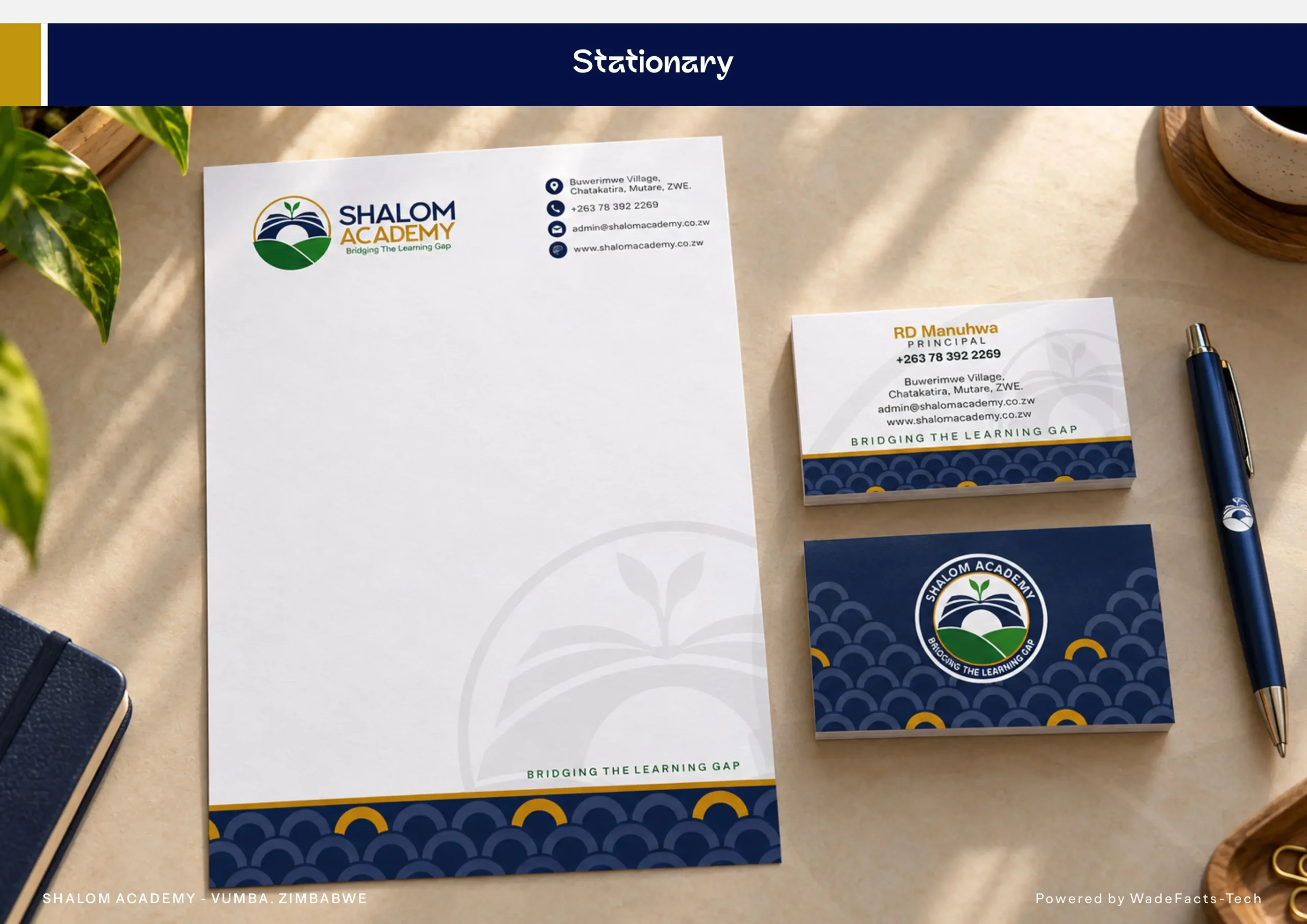
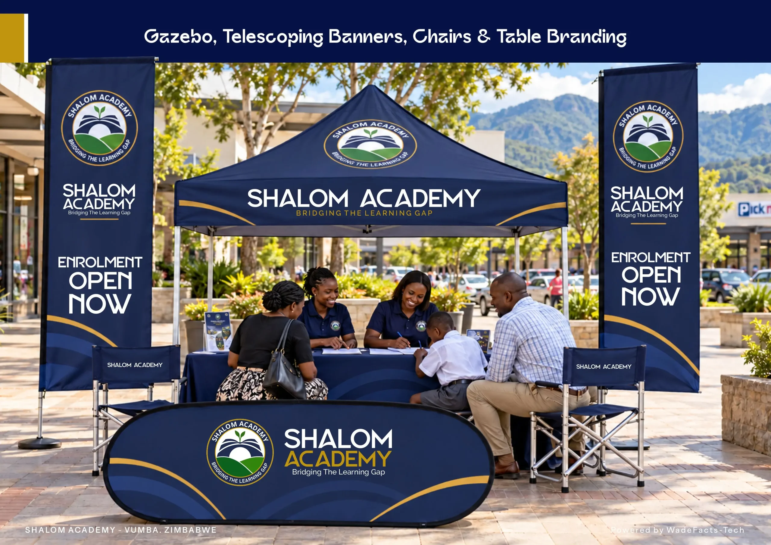
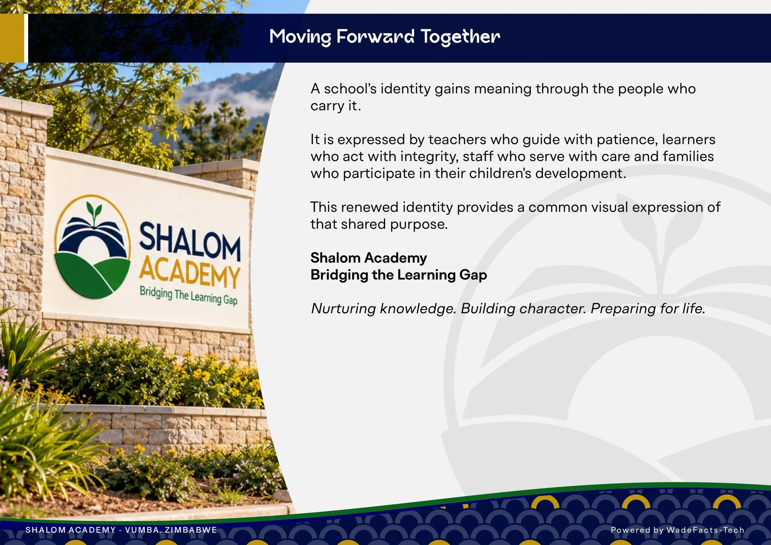
Uniforms, stationery, learning materials, signage, transport and enrolment displays provided opportunities to test its versatility. Each application was considered as a point of contact between the academy and its community, whether a parent reading a letter, a learner wearing a blazer or a family encountering the school for the first time.
The aim was a polished, welcoming presentation that communicates care, confidence and a commitment to quality.
An identity with room to grow
The resulting identity gives Shalom Academy a visual expression of its purpose: nurturing knowledge, building character and preparing learners for life.
For me, this project was an exercise in turning a school’s beliefs into a visual language people could understand and connect with. Its strength comes from the relationship between the ideas, the setting and the everyday details, all working together to tell one coherent story.